

Intro
Kevin's Story
A story about making every inch count in a small downtown condo
Intro
Kevin's Story
A story about making every inch count in a small downtown condo
01/05
BACKGROUND
Harbour in the Skies, a small 650-sqft condo located in Coal Harbour, Vancouver’s most sought after neighbourhood. Living on the 21st floor, our client, Kevin S, had breathtaking views of the North Shore Mountains and the Burrard Inlet. Kevin loved the potential his new home had, but it lacked the masculine and sexy aesthetic look he desired. Although he was just steps away from the seawall, Stanley Park, and several exotic restaurants, something was missing.
Kevin enjoys the finer things in life and wanted his home to reflect that. After several traveling excursions throughout Europe, he fell in love with the sleek, clean lines of modern Europe. It was the driving force behind Kevin’s renovation dream.
After contacting several construction professionals, Kevin decided to proceed with Level One because of their award-winning acumen and online reputation.

The Challenge- Condo Renovation Vancouver
The Challenge- Condo Renovation Vancouver
02/05
The Challenge
EXISTING FLOOR PLAN
In a small condo, it’s important to utilize every inch of space. When you walk into Kevin’s condo, you see a long hallway with lots of doors, which created an institutionalized like feeling. This institutional like feel wasn’t the only thing he disliked about the hallway. He noticed that the first thing he would see when entering his home was his toilet.
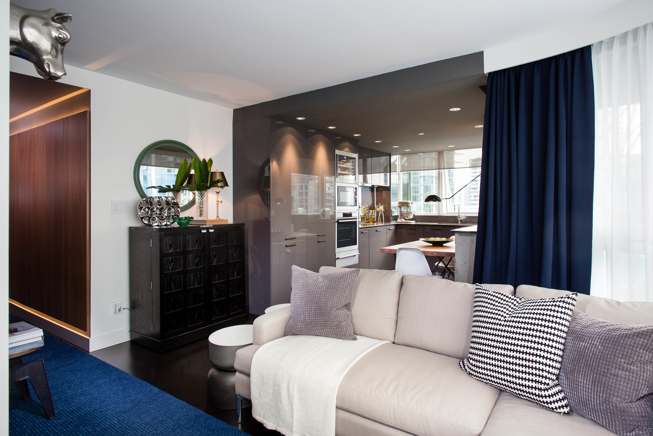
The living room was Kevin’s favourite place. It was bright with large curved windows, which maximized the view of the North Shore Mountains and the Vancouver Harbour. However, an awkward wall in the corner area of the space needed to be reconfigured so that the space could be functional.
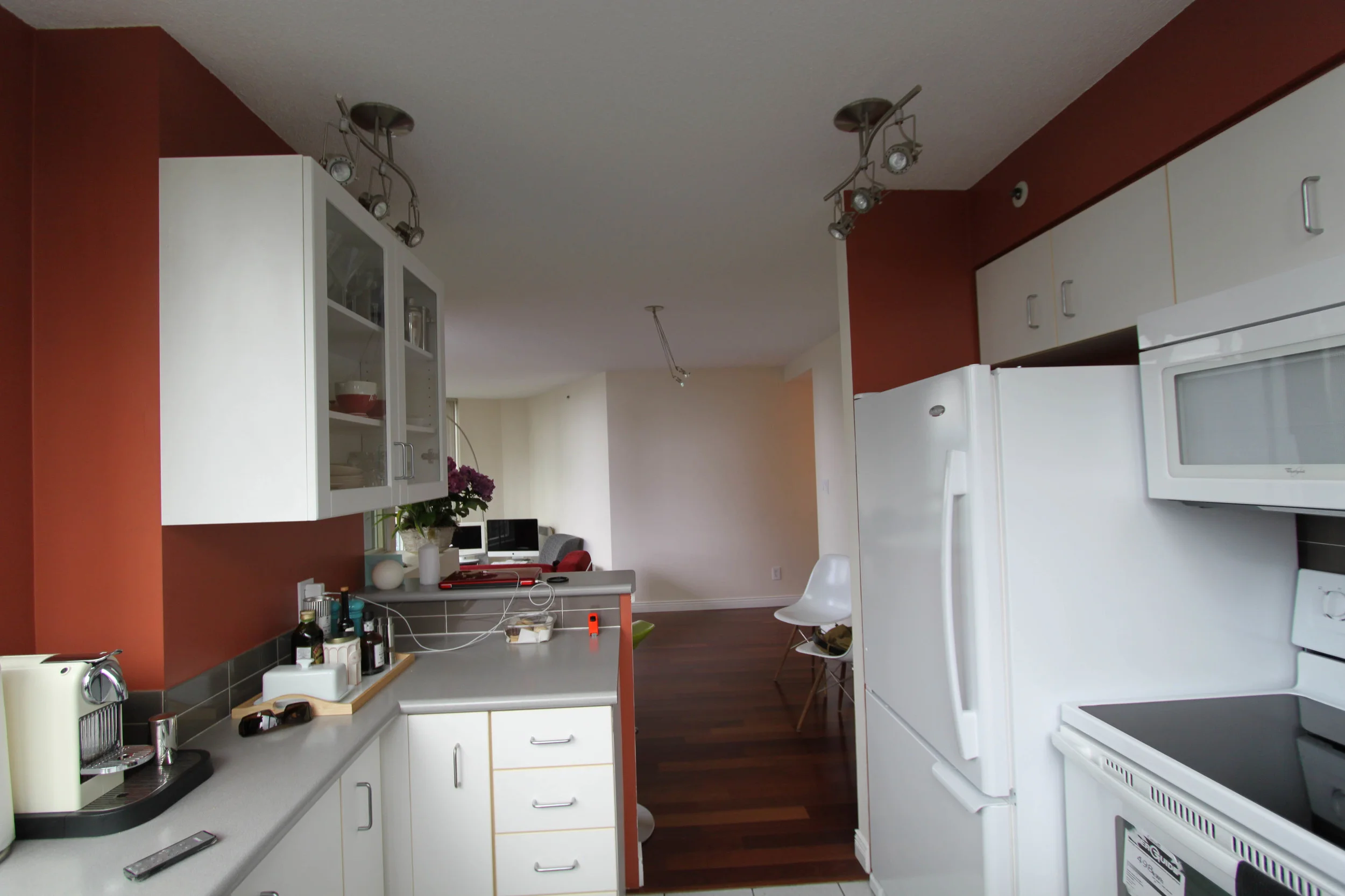
The kitchen was a space that lacked inspiration and functionality. A lack of counter space combined with a shortage of upper cabinets made storing kitchen items a challenge. In addition, the stove location wasn’t ideal as it was located right beside the fridge. As a result, when cooking, everything would splash onto the fridge. On top of being dysfunctional, the kitchen was severely outdated. However, any changes that were to be made were restricted due to the plumbing and electrical restrictions of the high-rise condo building. Therefore, it was imperative that the Level One design team come up with creative and unique solutions to overcome the structural limitations of the space.

The Design
The Design
03 / 05
The Design
PROPOSED FLOOR PLAN
The Level One design team wanted to change the way that Kevin would feel about his condo. We wanted every inch of space to be functional and beautifully designed. We wanted it to feel like Kevin was living his dream.
3D Render Image of the new hallway
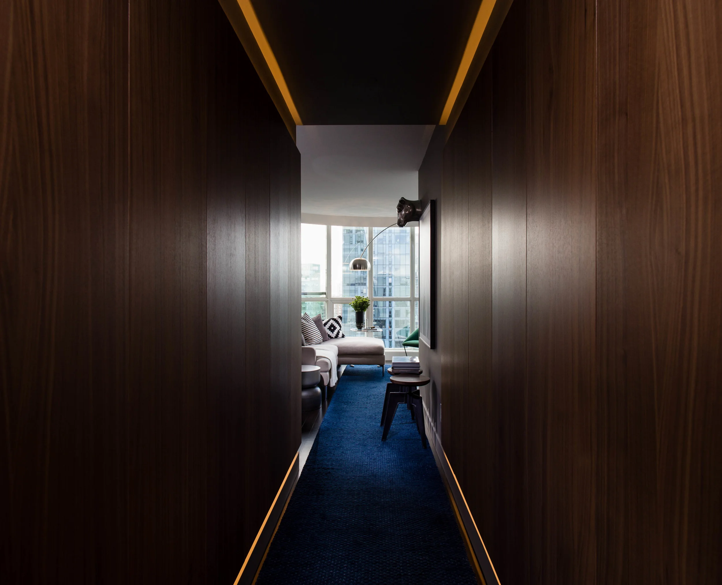
After several meetings and site visits with Kevin, the Level One design team realized that although, the hallway was long and awkward, it had potential. By changing all the doors, the wall colour, and the lighting, we changed the mood and feel of the space. A dark grey paint colour, LED touch control lighting under the new hallway doors, and a 30 ft long handmade carpet from Brazil created a sense of luxury and anticipation when entering the space. In addition, by changing the location of the bathroom door, Kevin would no longer see the toilet when entering the space.
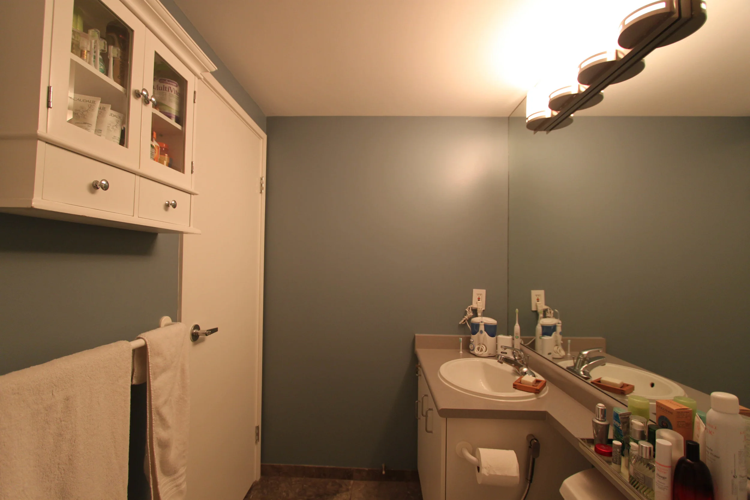
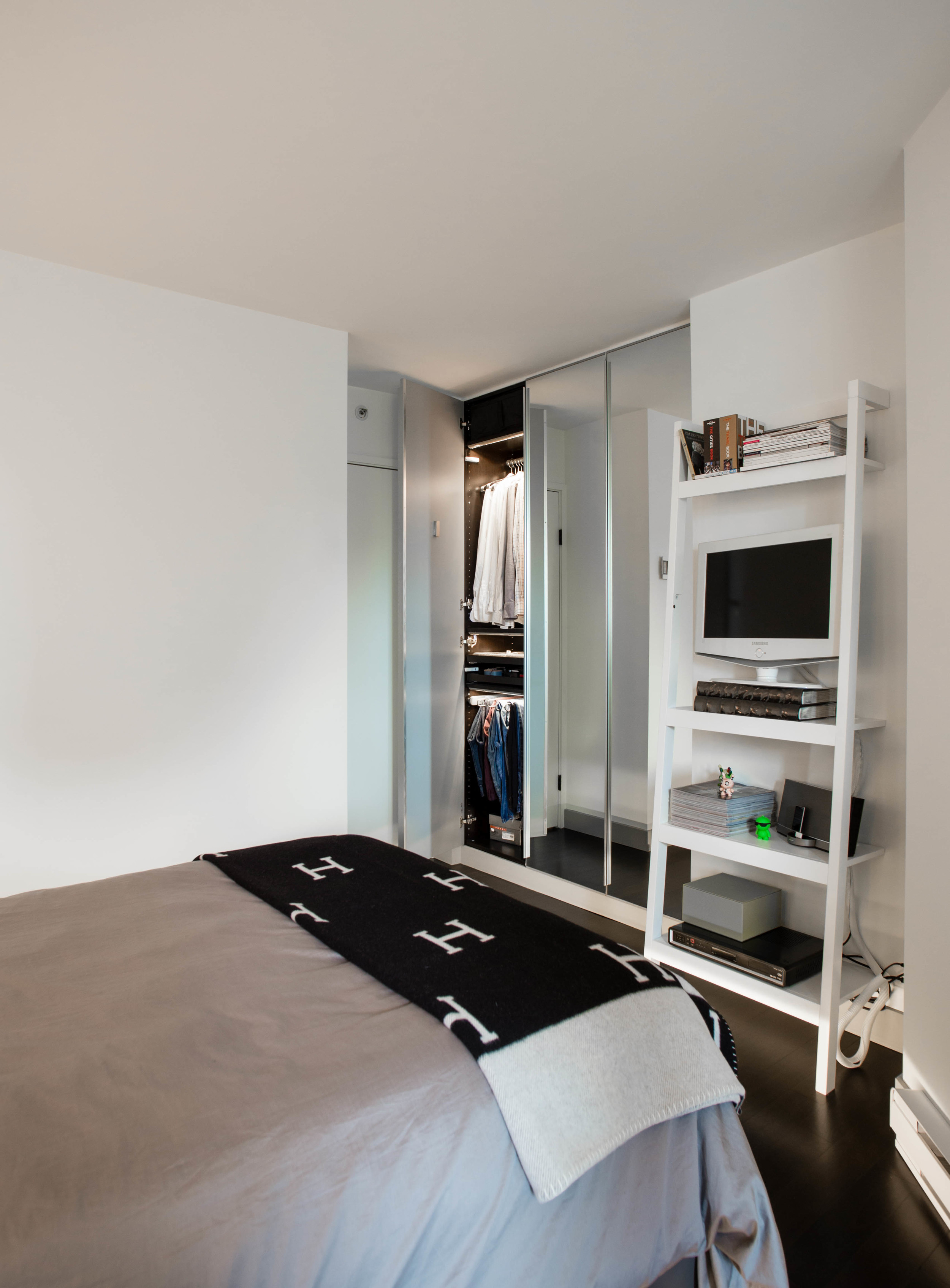
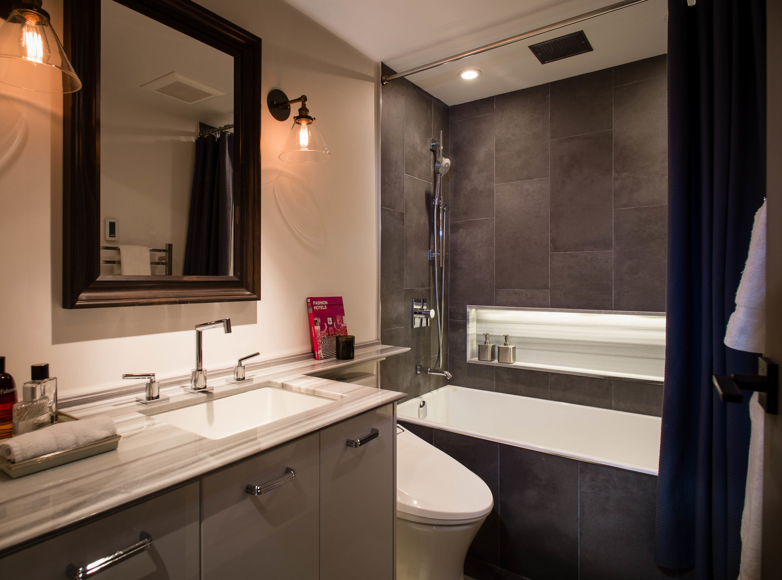
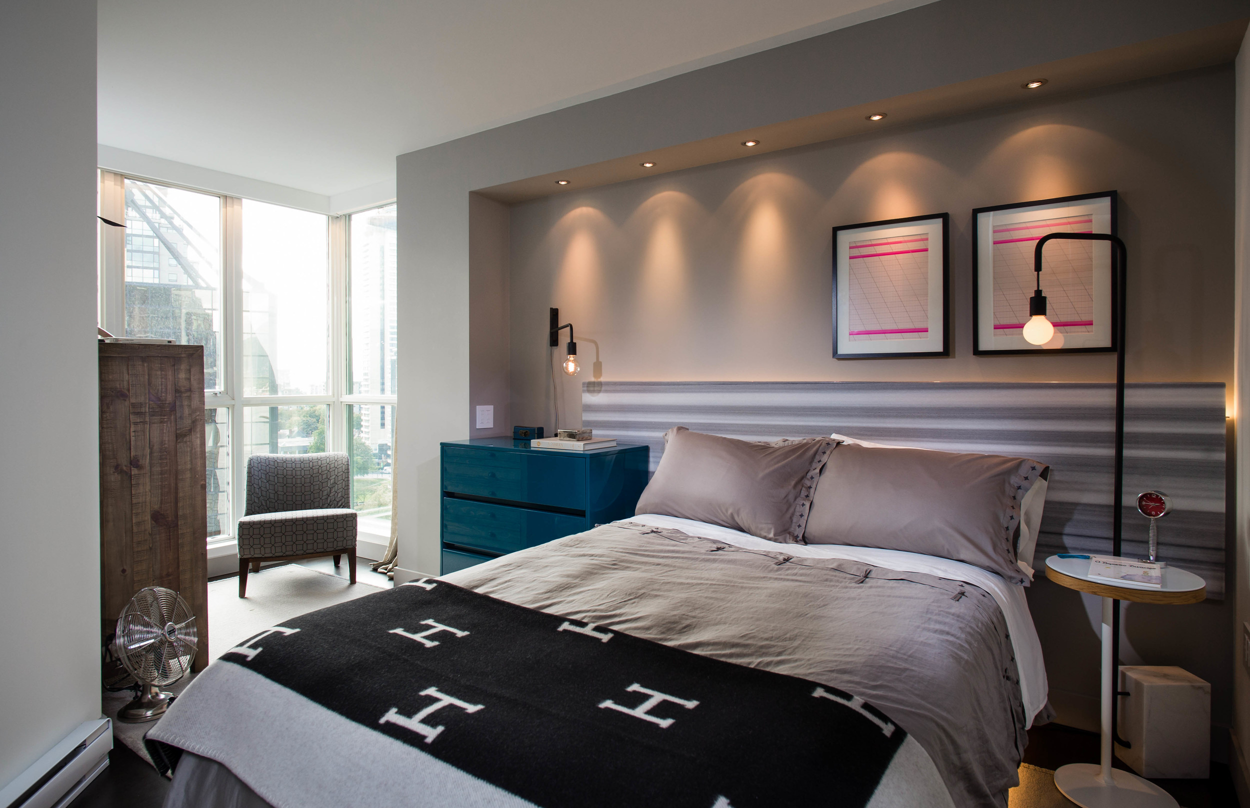
In a condo with only one bathroom and one bedroom it was important that the newly renovated space made a statement. Therefore, in the bedroom we added three pax system closets with floor-to-ceiling cabinetry to give Kevin ample storage for his clothes. Extra marble from the bathroom countertop was used to give Kevin a headboard. A design feature that not only saved the client money but also became a grand statement when entering the bedroom. In the bathroom, we added in heated floors, heated towel racks, and a new tub. This new tub allowed for less clutter and more bathing space. The addition of the niche above the tub created a space for Kevin to put his body wash and shampoo bottles. Under-cabinet lighting, programmable thermostats, a rain shower head, and marble countertops made Kevin feel like he was staying at the Fairmont Hotel.
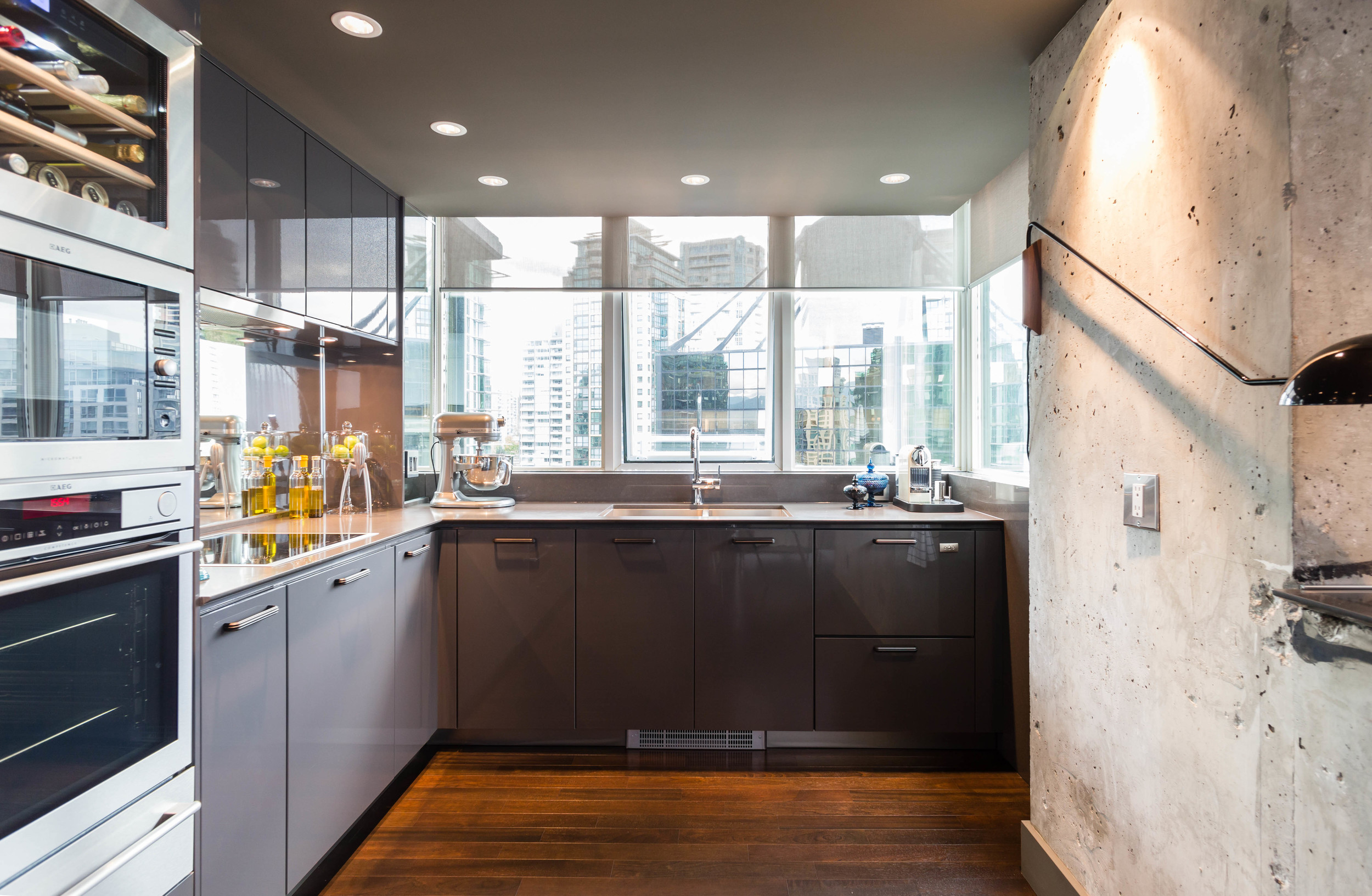
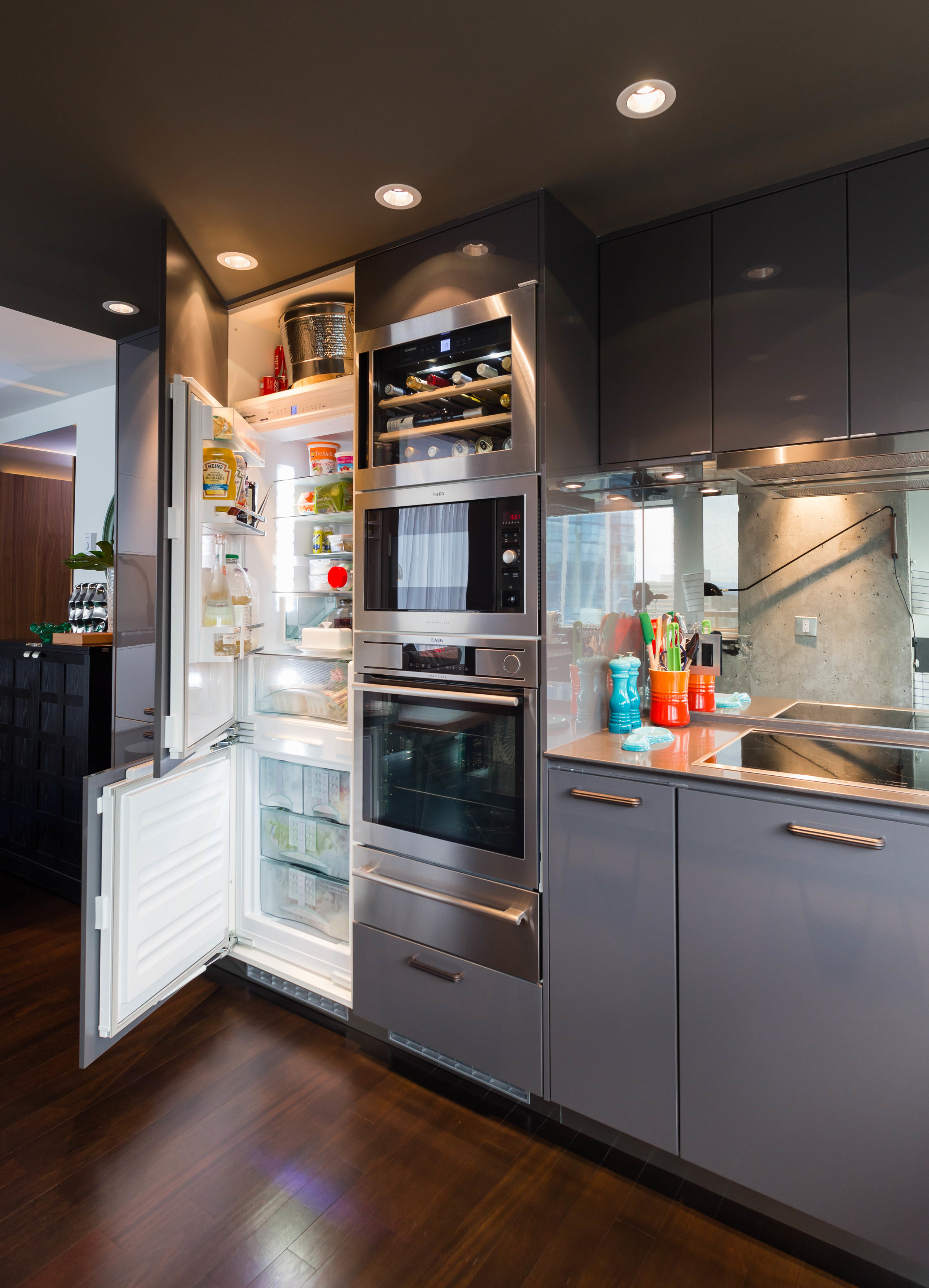
To tie the design together, we made the kitchen the focal point of the entire condo space. We wanted the kitchen to not feel like a kitchen but rather a continuation of the living room experience. Therefore, we wanted to hide the appliances as much as we could but also give Kevin all the features a chef would have. This meant an integrated fridge, integrated dishwasher, a steam oven, wine fridge, and convection microwave. More importantly, all cabinets and countertops were updated to match Kevin’s european flavour and style. Also, adding in little details such as, soft closing doors, automated pull-out systems, and LED task lighting gave Kevin the dream kitchen he always wanted.
3D Render Image of the new kitchen
3D Render Image of the new living room
3D Render Image of the new bathroom
3D Render Image of the new bedroom

The Build- Condo Renovation Vancouver
The Build
Getting our hands dirty
The Build- Condo Renovation Vancouver
The Build
Getting our hands dirty
04/05
The Build

The Result- Downtown Vancouver Condo Renovation
The Result
It's like a 5-Star hotel in Dubai
The Result- Downtown Vancouver Condo Renovation
The Result
It's like a 5-Star hotel in Dubai


