
Colour Theory for Interior Design- How to choose the colours in your home
If you’re considering a home renovation and are not sure how to choose the perfect colour scheme, we’re here to help. Whether you’re updating your bathroom, doing a large kitchen remodel, or a full home reno, here’s what you need to know about colour theory and how it can help you create a beautiful space.
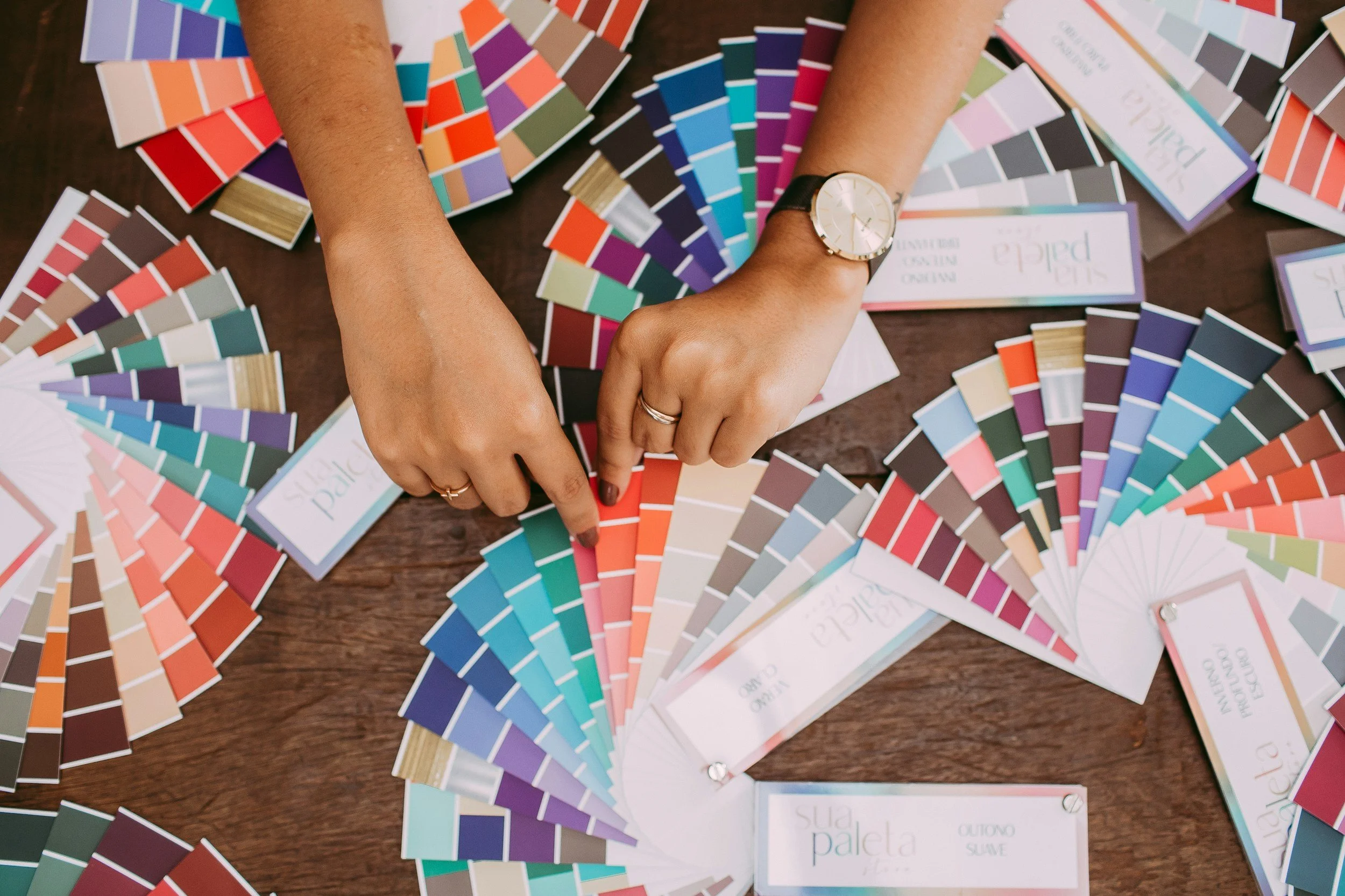
The Basics of Colour Theory
The colour wheel, a circular graphic that illustrates the relationships between colours, is the central component of colour theory. Three main categories comprise the colour wheel.
The primary colours are yellow, blue, and red. You can’t mix other colours to make these colours. Orange, purple, and green are secondary colours. These are created by combining two primary colours. Tertiary colours, such as reddish-orange or blue-green, are produced by combining primary and secondary colours.
What colours look good together?
As an interior designer, you want the space to have colour harmony. The term "colour harmony" describes a beautiful arrangement of colours, frequently accomplished using particular schemes:
Complementary colours are hues that are opposite each other on the colour wheel and when combined, produce a striking contrast and vivid appearance. Examples of complementary colours are orange and blue.
Analogous Colours: Yellow, yellow-green, and green are examples of colours that are adjacent to one another on the colour wheel. These pairings are more tasteful and melodic.
Triadic Colours: Red, blue, and yellow are examples of three colours that are equally spaced out on the colour wheel. This scheme provides a vibrant yet well-balanced hue.
Monochromatic colours: Differences in one colour's saturation and luminance. Think of many different shades of blue.
Colours' Psychological Effects
Colours are not only an esthetic choice. Any good home builder, interior designer, or decorator knows that colours can influence our emotions (especially in our home).
Warm Colours: Warm hues like red, orange, and yellow generate feelings of coziness, enthusiasm, and vitality. These colours are best for common areas of the home.
Cool Colours: Cool hues like blue, green, and purple evoke feelings of serenity, peace, and relaxation. These hues work well in bathrooms and bedrooms.
Neutral Colours: Colours like white, grey, beige, and brown are adaptable and neutral, making them a great base for rooms and allowing space for pops of colour and accents. They are a safe bet for any space and remain timeless.
How To Use Colour Theory in Your Home
Colour Balancing: To balance colours in the home, adhere to the 60-30-10 rule. According to this rule, the walls should make up 60% of the room's dominant colour, 30% of the room's secondary colour (upholstery), and 10% of the room's accent colour (accessories).
Taking Natural Light into Account: The quantity and quality of natural light in space have an impact on the appearance of colours. Cooler, darker colours work well in brightly lighted rooms, whereas warm, light colours work well in poorly lit areas to create a cozy environment.
Creating Focal Points: To create focal points, such as an accent wall or a statement piece of furniture, use vibrant colours sparingly. This brings attention to different parts of the space at different times to not overwhelm the human eye.
Personal Touch: In the end, the colours you choose should be a reflection of your tastes and style. Never be scared to try different colour schemes and modify them to fit your preferences and the purposes of each room.
Looking to re-decorate your home, or considering a home renovation in Vancouver? Get a free quote from Level One Construction.