

Intro
John & Alice's story
A minimalistic and modern paradise
Intro
John & Alice's story
A minimalistic and modern paradise
01/05
BACKGROUND
Living in a 100 year old house, John & Alice needed to do some upgrades. They did everything they wanted to do in the house including renovating the living room and the bedrooms, but the kitchen was last on the to-do list. John & Alice wanted to wait until the kids finished school and have moved out before moving forward with their dream kitchen renovation.
Now, that the kids are away from home, finished university, and education all payed for, John and Alice wanted to do something for themselves. It was time to get that dream kitchen they always wanted.
So, John & Alice turned to Level One Construction for help...

The Challenge
The Challenge
02/05
The Challenge
John & Alice love to bake and cook. However, their existing kitchen was small, cramped, outdated, and wasn't the most functional for a couple that loved to cook meals at home. The limitations of the existing layout meant that John & Alice had to walk around their counter and posts to get to their stove. These posts in the middle of the kitchen were breaking up the choppy flow of the kitchen. In addition, limited counter space made cooking and cleaning difficult. Often times two people couldn't cook at once because they kept bumping into each other.
Lack of sufficient storage also proved to be a problem for John & Alice. They ran out of areas to store food, mugs, containers, jars, and boxed goods. As a result, John & Alice wanted a new kitchen that would accommodate their love of cooking and hosting parties for friends and family.
LOCATION: Vancouver
Type of Project: Kitchen & Living Room RENOVATION
Building: House (2,800 sqft)
EXISTING FLOOR PLAN

The Design
The Design
03 / 05
The Design
PROPOSED FLOOR PLAN
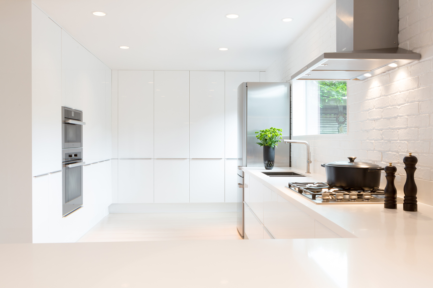
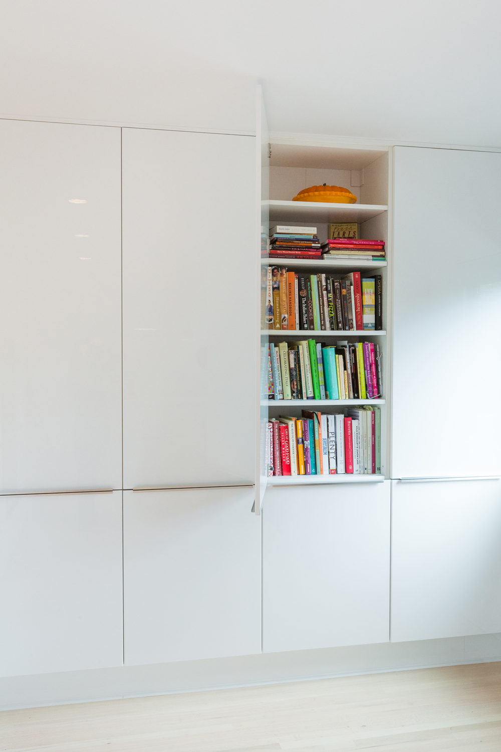
The goal of the renovation was to seamlessly integrate the new space with the rest of the house. The little details were important to achieving this marriage. We started off by expanding the scope of work to include the seldom used den that was next to the kitchen. By combining the two spaces we would be able to solve the challenge of limited space and, in turn, give John & Alice a bigger kitchen. However, combining the kitchen with the den resulted in the loss of some key storage closets which we were able to overcome by adding floor-to-ceiling cabinets in the pantry area of the kitchen. This design feature gave John & Alice more than enough storage for their kitchen.
In addition, we wanted to use the beautiful detail of the original house to integrate the two spaces together. This meant that the archway and moulding detail between the dining and living room were to be perfectly mirrored between the dining room and the kitchen, right down to the hidden closets. However, to make the new kitchen look like it had been there the whole time, the original oak flooring was matched and carried into the kitchen allowing the flow of the house to carry through.
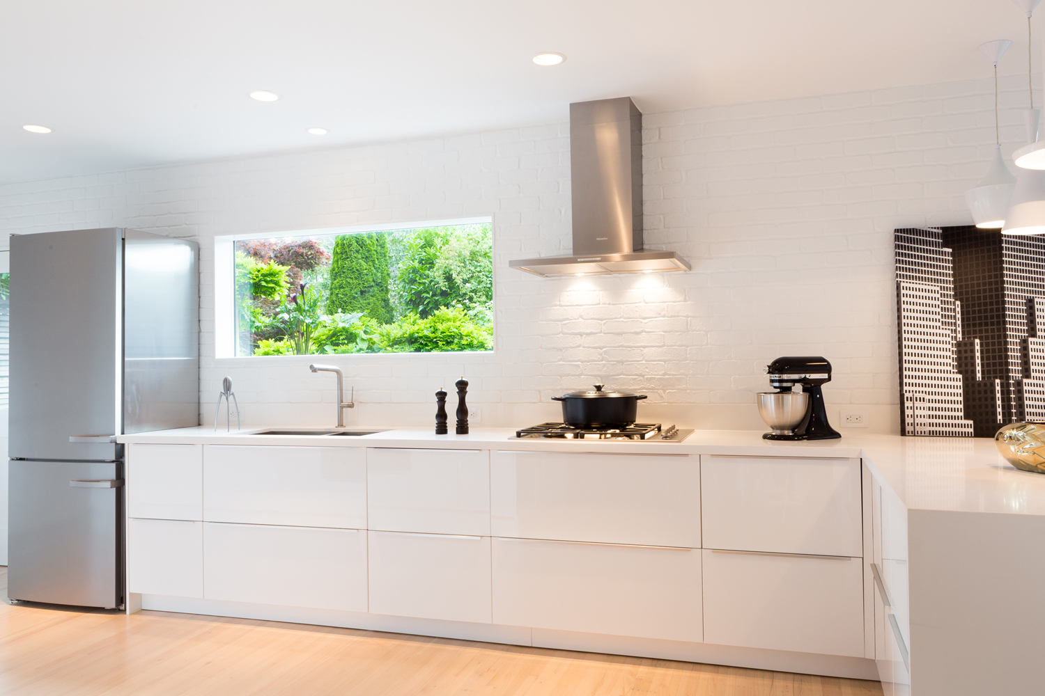
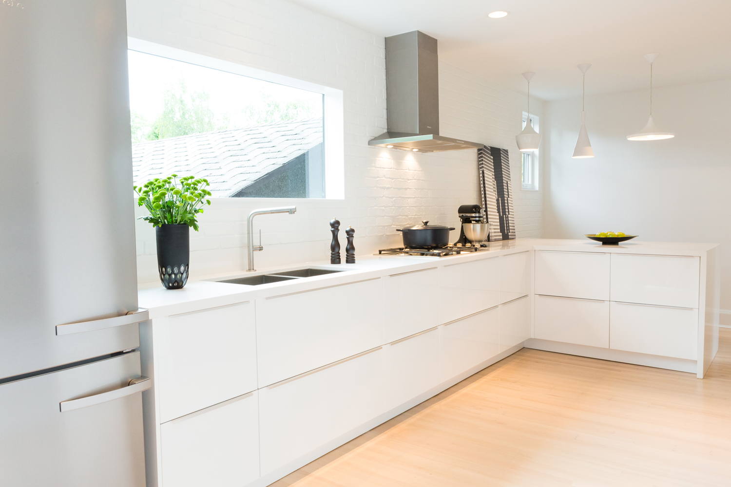
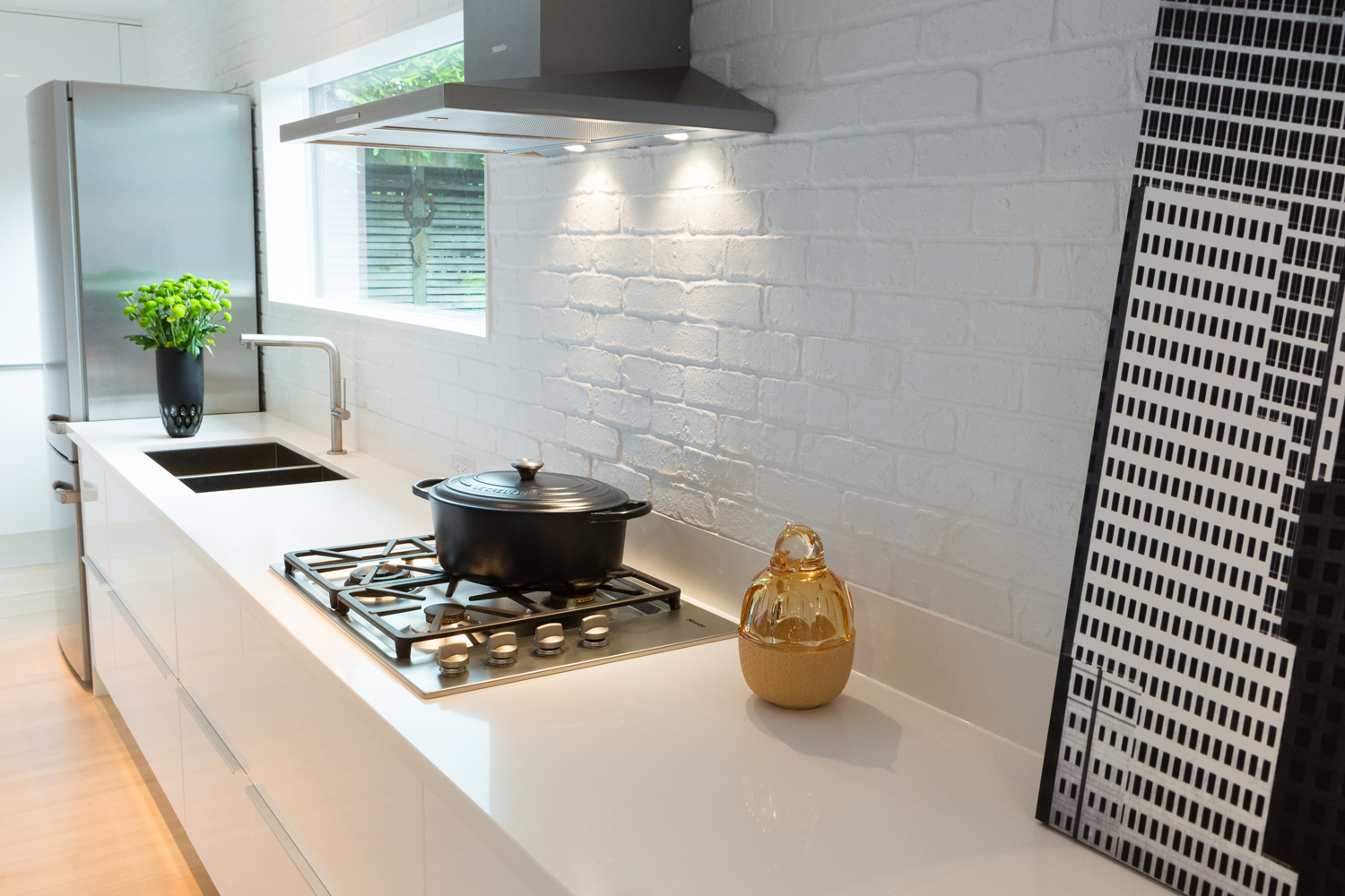
We didn't use upper cabinets in this design because we wanted to showcase the brick accent wall. The storage lost from zero upper kitchen cabinets was more than made up in floor-to-ceiling pantry. This corner pantry accommodates the bulk of storage for food and dishes in the kitchen. The subtraction of the upper cabinets allows the Tom Dixon pendant lights to be boldly featured over the eating peninsula as seen in the render images below.
3D Render Image of the kitchen from the view of the new peninsula.
3D Render Image of the dining room view into the kitchen.
We wanted to make visual lines a key aspect in this design to help the eye move throughout the space. The cabinet break lines are at the same height as the counter tops creating one continuous line. The paneled dishwasher blends perfectly with the rest of the kitchen cabinetry. The white quartz countertop flows down into a waterfall edge at the end of the eating peninsula, being the final grounding piece to visual lines.
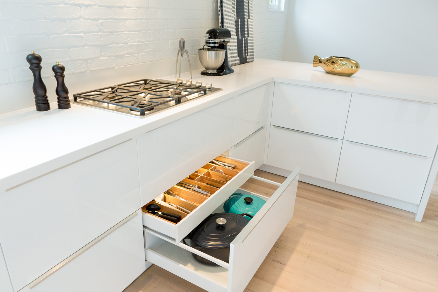
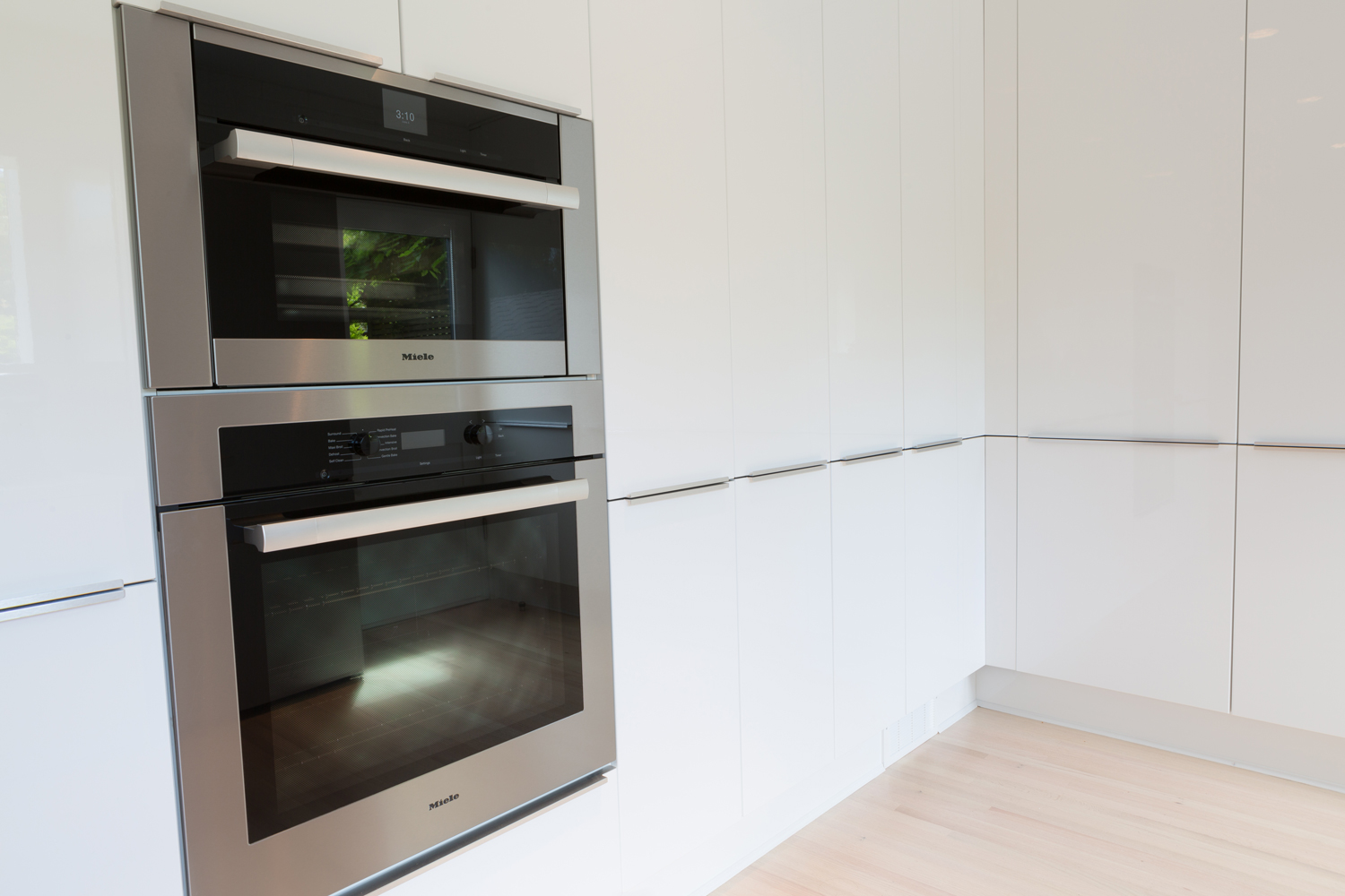
Although the kitchen is all white, it is off set and given visual interest through texture and use of different materials. The white allows the beautiful expensive appliances to be showcased along with the newly refinished flooring.

The Build
The Build
Out with the old and in with the new
The Build
The Build
Out with the old and in with the new
04/05
The Build
Once the demo phase started we found that we had just opened up a a big bag of worms. The kitchen floor was pieced together by odds and ends which included old pallets from tucking companies and various old pieces of timber that they must of found here and there. The previous builder didn't even span to the walls or beams and were basically being held together by four layers of plywood and ship-lap. As a result, the floor was a little bouncy. In case you were wondering, floors shouldn't be bouncy.
When the drywall was removed from the walls we found the existing old 20's balcony railing and spindles still in it. No one even tried to remove it but instead just built around it and incorporated it in the existing space. We found that the post system meant to hold up the 2nd floor above the kitchen did not transfer the point loads down to the basement foundation. The second floor joist were laying flat with 2ft centers rather than standing on edge with 16" centers as per the BC Building Code.
As per the Level One construction process the Engineer came out for a site visit & stopped all work immediately as the structure was deemed unsafe and could collapse . He needed to re-access the site and give us direction as to how we could correct the situation. If we wanted to achieve the proposed open concept floor plan that the designer envisioned we needed to rebuild both floors according to the BC Building Code. This included digging down the foundation walls in the basement in the locations of the point load transfers and under pinning as per his request. The video below shows our guys hard at work rebuilding both floors.

The Result
The Result
A kitchen that even a 3-star michelin chef would be jealous of
The Result
The Result
A kitchen that even a 3-star michelin chef would be jealous of


